
Today the Huffington Post published a graphic depicting total tax as a percent of various sources. This was published under a column titled “The 1 Chart That Reveals Just How Grossly Unfair The U.S. Tax System Has Become”:

The author states:
What this shows is how dramatically corporate tax contributions have shrunk in the past several decades, and how our personal taxes have risen to fill the gap. Payroll taxes now make up 35 percent of all federal government tax receipts, up from 11 percent in 1950. Corporate income taxes, meanwhile, now make up less than 10 percent of federal revenue, down from about 26 percent in 1950.
Anytime anyone offers up charts or statistics to prove a point, people should examine to see if the data supports the conclusions. One common trick, as illustrated in the article, is to show a misleading and irrelevant graph to stir up false rage. As a corollary, just today when I was talking about how increasing government spending leads to falling economic productivity, someone counted by saying Obama reduced the spending deficit (that is the difference between what the government spends and what it takes in). A government can have zero deficits if it taxed 100% of all economic activity and spent 100%, but that would make all Americans miserable poor. But yeah, the deficit would be eliminated. One thing has nothing to do with the other. Ensure the presented facts support the conclusions.
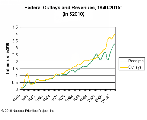
Back to the chart. This chart might be served better if they provided a side by side comparison of nominal taxes as well. Over the same timeframe, government spending increased from about $0.5 trillion to $4 trillion (adjusted for inflation):
So while the percentages might change, not only does the original graph coverup the scope of the change, but also the net scope of the measured sources. It is more than likely that all sources all experienced increased taxes and no decreased taxes, but the mix was in flux. The percent chart hides this.
The biggest problem with the chart, however, is that it just assumes taxes can be targeted. As a thought experiment, assume a local baker is informed there will be a new tax on business. All bakers will have to implement the tax. Will the baker look at her income, deduct the amount of the tax and then just write a check to the IRS, leaving all else unchanged? Because people respond to incentives, the baker will raise the price of her bread. Of course customers will consume less (this is known as deadweight loss). But the baker will not just take the entire cost of the new tax straight from her salary. The tax has to come in part from the customer, who is presented with higher prices (or less service, or less bread). The cost must come from somewhere. This can be seen in action as people watch the results of Obamacare.
What the chart just ignores is that money is fungible. Consumers end up paying most of the taxes, whether they are called Individual, Corporate, Payroll, or Excise. For an excellent article on this, see The New Confusion about Taxes by D.W. MacKenzie.
